


 |
| See something familiar on this box of tissues? |
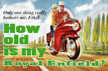
Perhaps it was meant to acknowledge the brand's home in India. The company said the opposite: "Our logo is now fresher, more vibrant and contemporary — while rigidly holding on to its British-motorcycling roots."
Whatever its intent, Royal Enfield was certainly not hoping to make people think of blowing their noses.
| Royal Enfield's brand logo, introduced in 2014. |
"I noticed the logo on it looked familiar. So I Googled Enfield's new logo. It seems Royal Enfield may have gotten the idea from Royale tissues," he wrote me.
Royale also makes paper hand towels and (you knew this was coming) toilet paper. Replying to my question on Twitter, the company said it has been using its current logo since 2012.
Royale has been making toilet paper for more than 50 years. The company is best known for the images of cute cats it uses on its products. Its Tiger Towel paper towels are "Tiger Strong" while its bathroom tissues are described as "Kitten'y Soft."
 |
| Cute kittens mark Royale brand products. |
While there are similarities in the "R" and the "O," the Royal Enfield logo is more colorful and complex and uses upper case letters instead of caps and lower case. It hints at having serifs. The Royale font is all sophisticated simplicity, using a minimum of color.
And then there is this: the combination of capital "R" and "O" seems almost obvious. It can probably be found elsewhere. But there is nothing obvious or natural about the combination of "L" and "D" at the close of the Royal Enfield logo.
Although it calls no undue attention to itself, that combination of "L" and and "D" perfectly closes the logo, balancing the heavy "R-O" combination. That's original work.


That's just swell! Here come the trademark infringement lawsuits.
ReplyDelete